Pampers for the baby’s day-out
BY ADMIN / FRIDAY, 13 FEBRUARY 2015 / PUBLISHED IN FMCG, HEALTHCARE

Awww, the charming lady, carrying the baby, felt awkward when her arms were wet with the so-called ‘nature’s call’ of the kid. Well, “the baby likes you”; comes a voice from behind and everyone laughed it away. But, can you take it positively every time the baby wet your lap? Of course not! This ‘of course not’ feeling inspired a grandpa to make the most useful thing in the world while you grow your little one.
Creation of diapers that you can breathe, yes you heard right, is a bliss. Don’t you think? I dedicate this story on behalf of you and me to that god grand father, who turned those wet-moments into happy ones!
How the Pampers was introduced:
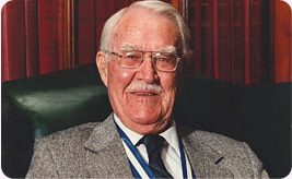
In 1965, a grandpa by the name of Victor Mills, who was a Chemical Engineer in Procter & Gamble, found it cumbersome to change the cloth diaper of his new born grandchild again and again. Therefore, he requested the research team at the Proctor and Gamble exploratory division to make a diaper which a baby could wear for a longer period of time and yet not be uncomfortable. Also could be easily disposable. The P&G team found out a solution and ‘Pampers’ were born.
… they overcame the drawbacks in no time!
The Pampers was a boon, but had a few shortcomings. First, they were quite heavy and a handful. Secondly, Dallas in Texas, had a hot climate, a very hot climate. These diapers made of thick plastic were uncomfortable for babies, thus they used to cry and also develop a nappy rash. And the third issue was that they were too costly for parents to buy regularly.
The team at P&G went about trying to sort out these drawbacks. After six months of hard work, they came out with 37,000 handmade diapers, which were readily accepted by parents for use.
The History of the logo:
1961:
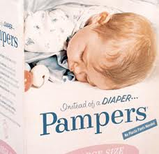
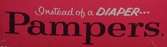
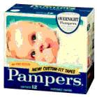
There was no logo when the first product was sold to the first customer! It was packed in a plastic black bag with a hydrophobic sheet. Don’t get disappointed, a label is on its way! Later in the test market in the city of Peoria in United States, the first logo of pampers was advertised to boost up sales. It was a simple blue font, with each alphabet placed separately. A peacefully sleeping baby’s picture was kept as the face of Pampers.
1962 – 1966:
Pampers has already made a good start in the baby product market. However, they had to be pinned together with safety pins to keep in place. This became a matter of safety as they were dangerous and uncomfortable to the babies. So, they had to come up with another solution to hold the diaper together. Also, these diapers were not 100% leak-proof, so another alternative had to be found. Although the label of a sleeping baby was attractive, the diaper quality had to be improved.
During 1959, first time, a continuous process was first designed in the world by the P&G diaper manufacturing machine. The machine’s output was 150 pads per minute.
1966 – 1985:
The new, improved Pampers were introduced with the new label of the brand. The red and black coloured label helped one to find the packet of pampers easily on the store shelf. The bright color helped one to recognize Pampers’ pack. The new Pampers was made with double gussets. They had elastics at the waist and legs, with proper fitting.
Instead of the pins, stick tapes were added to hold the diapers together. Surprisingly the consumers asking for a diaper used to call-out ‘Pampers’. The label said it all. A baby wearing Pampers was looking cool and comfy. The label helped the company move forward the message of comfort.
Parents were happy as they no longer had to go through the harrowing cycle of washing and drying of endless nappies. Use and throw was becoming the buzz of the day. This, of course, might have made the inventor ‘grandpa’ happy. Pampers also came up with diapers for toddlers and premature babies.
1976:
During 1976, the new luxury diapers were introduced with the brand name of ‘Luvs’ with a tagline “Live, Learn & then Get Luvs”. They were ultra thin and lined with a gelling material, which cut down their weight at least 50% from the old Pampers.
1985 – 2001:

The new logo of ‘Pampers’ used during 1985 and 1992 was softer, smoother, just like a new born child. The diapers were just like the new logo- softer, thinner and with a powdery fragrance.

During the end of 1900s, P&G team not only used the new logo extensively, but also a the powerful tool of advertisement to boost the sales of Pampers. Advertisement played a large role in making Pampers a well known name in the world of diapers.
In the movie, “Three Men and a Baby”, P&G paid $ 50,000 to cross-promote their diapers. It also sponsored the TV show “Make Room For A Baby” on the Discovery Health Channel. Mothers being the most important part in the sale of diapers, P&G used the strategy of mailing Pamper samples to them. Pampers brand got a place in their minds with a powerful thrust in.
2001 – 2013:
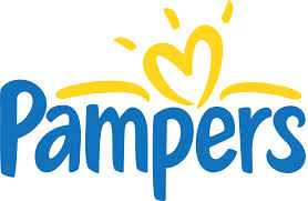
Turn of the new decade, the company came up with a new strategy and a new logo in 2001. The P&G made better and newer varieties of Pampers for newborns upto 5 year olds. As the diaper industry expanded, so did the logo. The new yellow, blue logo with a white background gave a comfort feeling. A heart sprinkled with yellow sunshine made parents feel safe to use the new Pampers for their children.

Proctor and Gamble took up a worthy cause to fight for; the fight against Sudden Infant Death Syndrome(SIDS), a cause of death of babies in the age group of 1 to 12 months of age. The cause of SIDS is unknown, but one of the SIDS prevention strategy was by putting the infant to sleep on their back. As the new logo was a picture of warmth and protection, the company decided to their bit to protect infants from this sudden death by printing the design of a baby sleeping on its back. It is the first time that life saving information is being given to parents in such a novel way.
This was the story behind Pampers brand, designed specially for little soft bottoms. Yeah! the story continues with a new spices, and the baby sleeps.
All Intellectual Properties referred on this website are absolutely owned by their respective owners.